…or how did anyone approve this design?
This graphic may help if you’re trying to setup a Gmail DKIM key using this instruction and having thoroughly searched all the icons, the handburger menu and the thing with 3-vertical dots on the right…
Sign into your Google Apps Admin console, then select Apps -> Google Apps -> Gmail -> Authenticate email
Here we are, all signed in. So where is Apps? (click to zoom in)
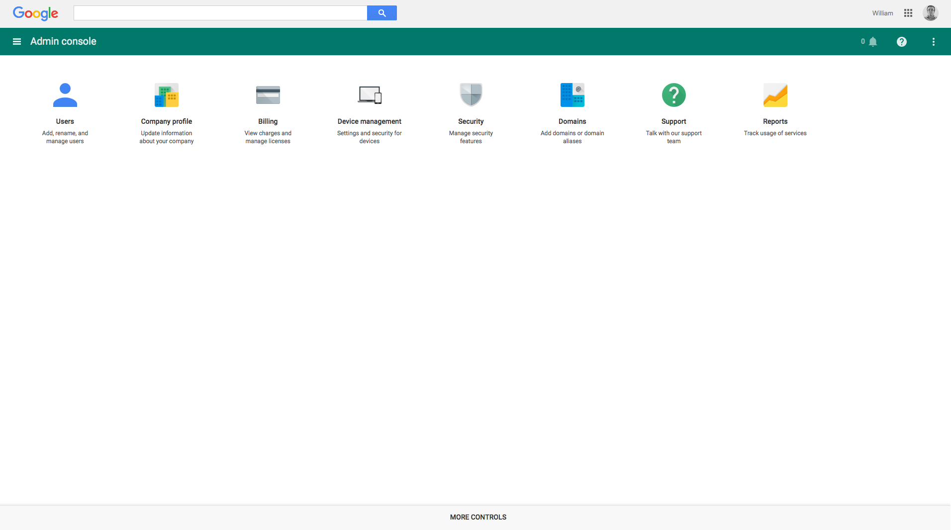
Give up?
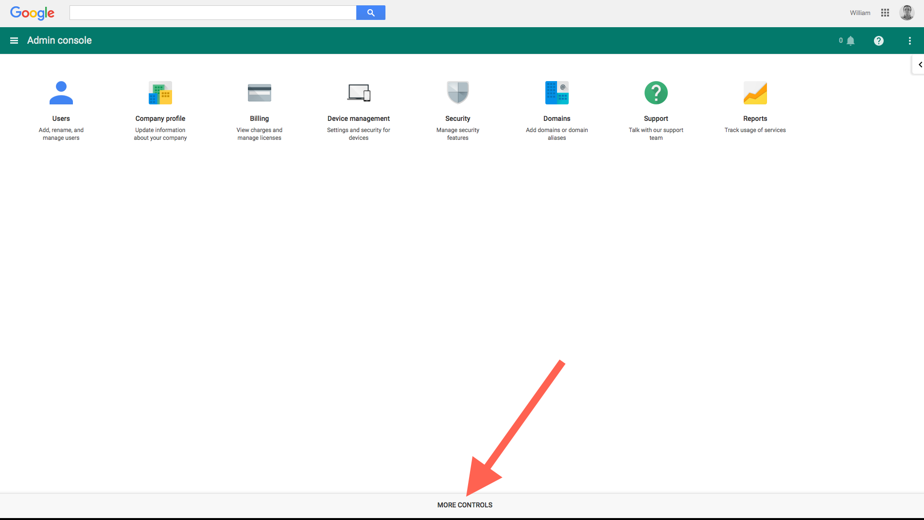
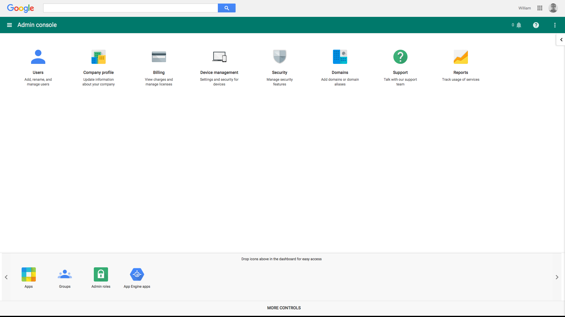
Of course, if you do drag and drop the icons up into the main section, they’re then added to the left hand nav…
Opinion: This is a situation where ease of use for users with medium to large desktops screens users matters just as much as ensuring things look ok on mobile. (It’s a control panel, so desktop use will be higher than normal.) Adding important links to the footer is usually a bad idea anyway if it requires a lot of scrolling, as they’re less likely to be discovered, but it’s worse if said footer is effectively concealed by vertical white space: users won’t naturally look down. The four extra icons are for important settings and it wouldn’t exactly look crowded if you put them next to the others. Alternatively, you could use a “More” icon or place explanatory text underneath. The documentation could include a direct link to a human readable URL, rather than requiring users to navigate the menus.
Note that all the extra features are available for the free, legacy Google Apps account. You don’t need to subscribe to Google Apps for Work.